minimalism
made on may 3, 2025
as someone who has been an artist of many kinds for years (and also as a child at that), there are certain things i've picked up on in my time that i'm sure a good portion of people like me have noticed too, and it's not something i really like: minimalist design being spread into the modern world.
every day, it seems as if all of the buildings, logos, and other bullshit i see are just the bare basics in design philosophy with no flair added whatsoever, and it gets worse with every passing minute (at least from what i see and know), and i'll provide a couple of examples (ok i lied. they're just 2 examples.).
first example - architecture

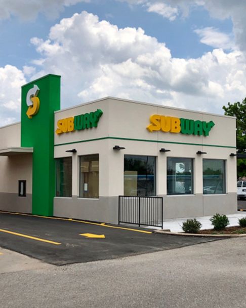
i'm not an architect or even a businessman, so i don't really know the logistics of why buildings are like this nowadays, but i will say this: unless you are a car dealership, making your building basically a box is fucking stupid. it's like making what's essentially the real life version of a faded out work in progress sign on a ice cream parlor, both figuratively and literally. because speaking of car dealerships: if i went into photoshop and removed the logos from that jpg of a subway building, it will probably look like any other building of today, except with green paint splattered on.
of course, i'm sure if i contacted some company about this kind of design trend, they'll say some chicanery like "it's cost effective!" and/or "it's safe for the environment!", which i don't think are any more true in the slightest. the cost effective one i could believe, since companies are exactly bottom of the barrel to be pulling this off, but environmentally friendly??? this doesn't even look like it's friendly to the environment, let alone human friendly. i mean, it makes sense, money wise. instead of having to demolish another pizza hut's big ass red hat, we have another square building that the gremlins can take over again without doing the most work on as per usual.
second example - graphics

i don't feel as if i need to explain much here. they took the intel logo and removed the swirl. why? what was wrong with the swirl? do people not like the swirl, intel? or do they not like you, even?
this example is actually a lot more worse than the architecture one, because you actually can't escape minimalist logo design, unlike with buildings where there might be some old places that have the same look from 20 years ago.
ok let's get back to it
and you might be thinking "but james, was everything like this?" (or not. maybe you're thinking "what are you doing in my house? get the fuck out before i fuck you or else i'll call the police.")
to that i say no. not exactly. sure, there was a lot of design work back then. i feel like everyone knows that. however, something i realized is that people tend to interchange towards the words "simple" and "minimalist" when it comes to design.
i think these words are a lot more different than people make them out to be. "simple", in my eyes, means that the design is basic, yes, but is easily expandable, and has more room to grow. take for example the apple logo. yes, you could argue it is minimalist, but i'd say it's simple, because not only does the logo actually look like what it's trying to mimic, but it has more options as to what it can be customized upon (altho i will say that apple is kind of the worst example to put here but fuck it).
"minimalist", however, is just the bare minimum. there is nothing else that's added or anything that could be of any use. it's like if you handed your boss a piece of paper that came out of the typewriter, and in small text reads "Harold Inc." something basically straight out of the clerks title screen. yes, it works for title cards. no, it doesn't work for a logo that everyone is going to see in advertisements everywhere across times square.
conclusion
i think you get my point here, but what i'm trying to say is that the mainstream ideas of design in pieces of the world are a lot more... staler? yeah, that works.
kthxbai. >w<